GasNet
Logo & visual identity
_
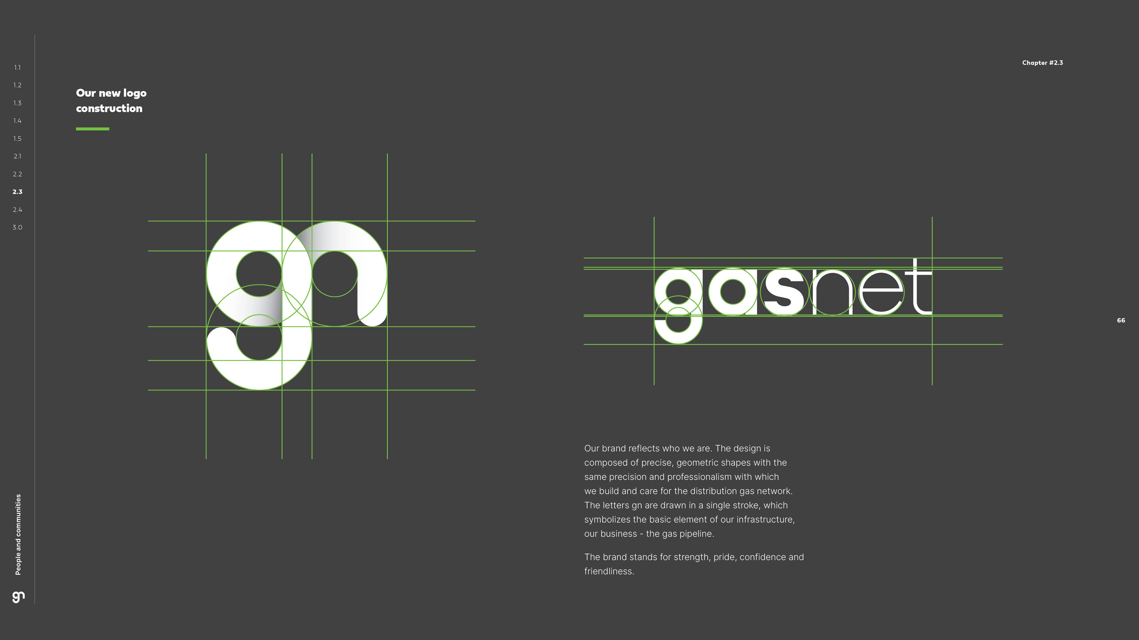
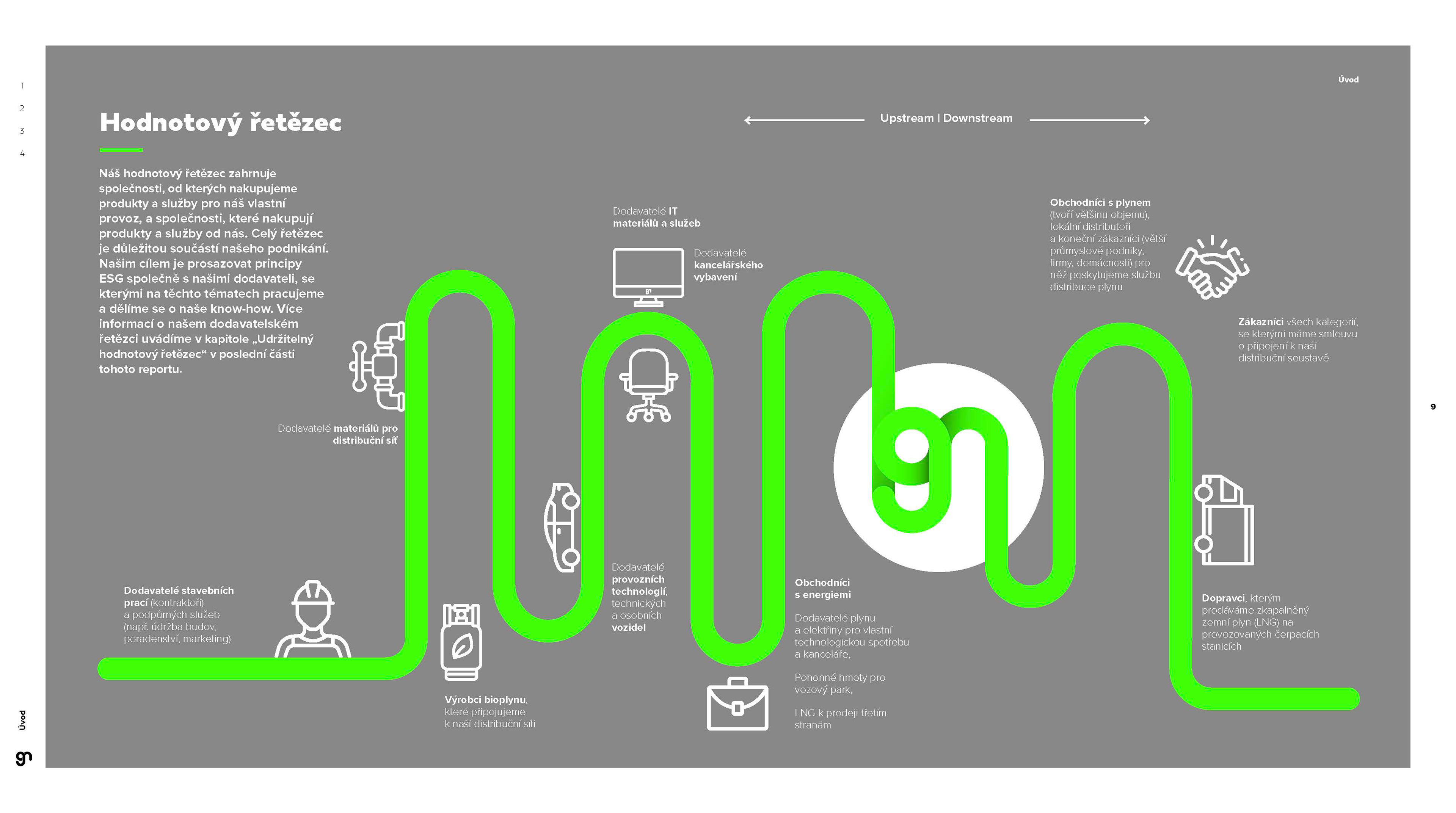
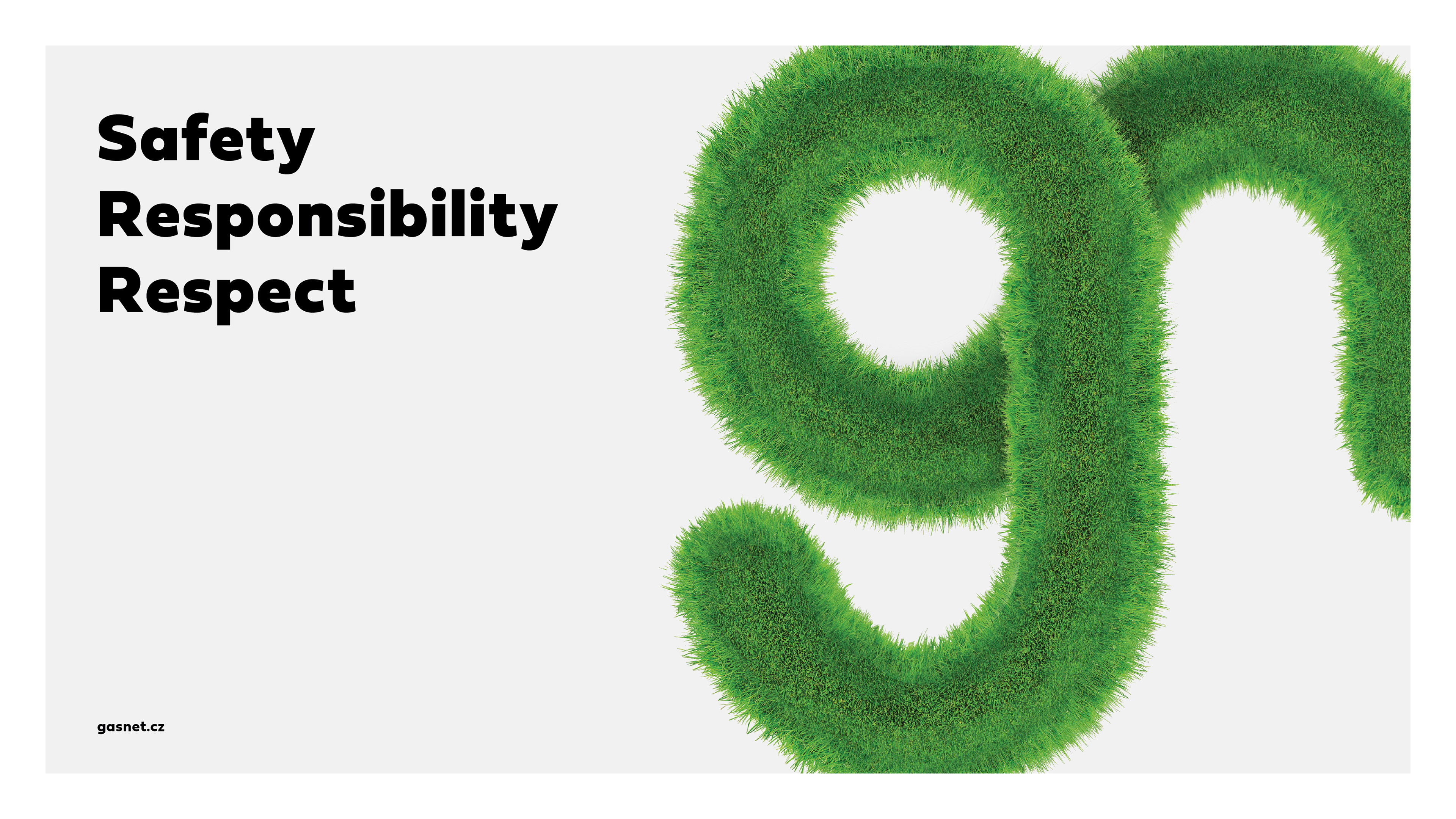
Probably the most complex project I have been a part of was creating a new logo and brand for GasNet - Czech main gas distribution network. I made a logo which reflects the industrial pipeline. Then we wanted to avoid any clichés in the industry (which is overuse of blue shades) and also emphasise sustainable approach of GasNet, and therefore this strong green was a clear choice.
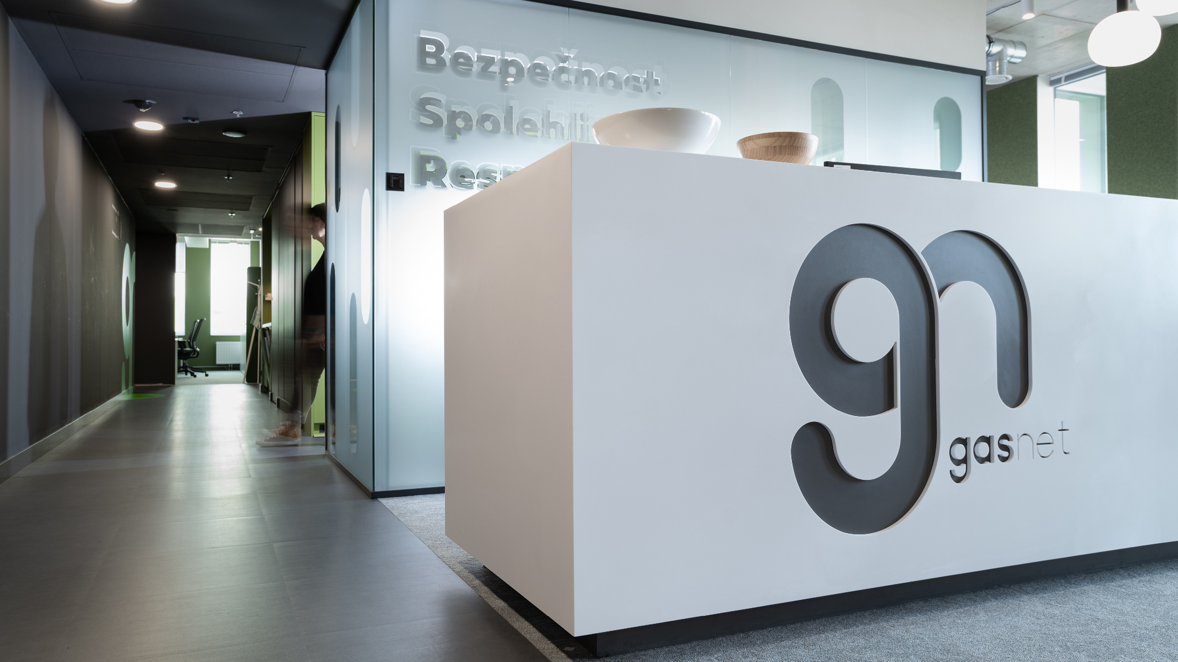
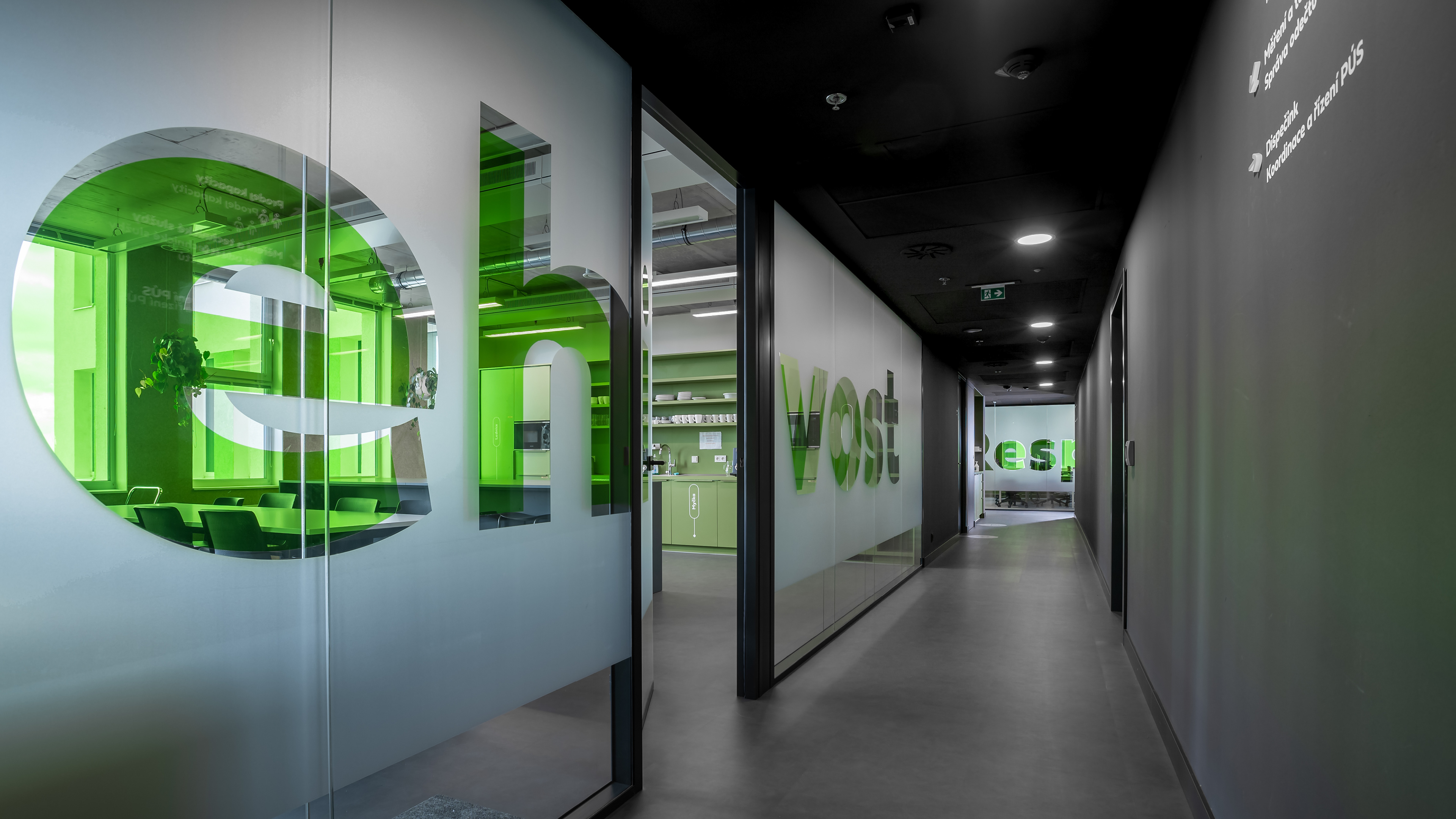
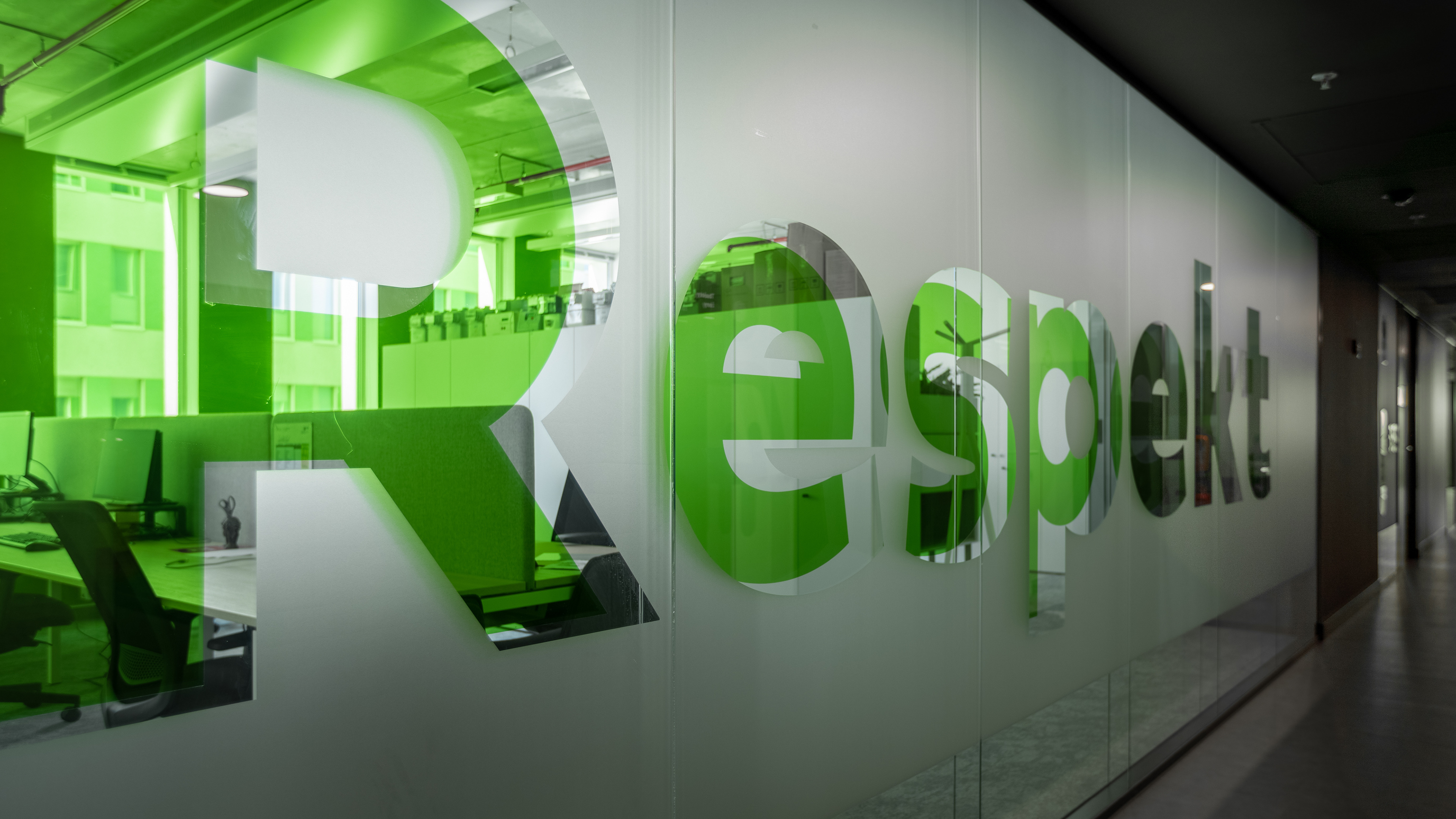
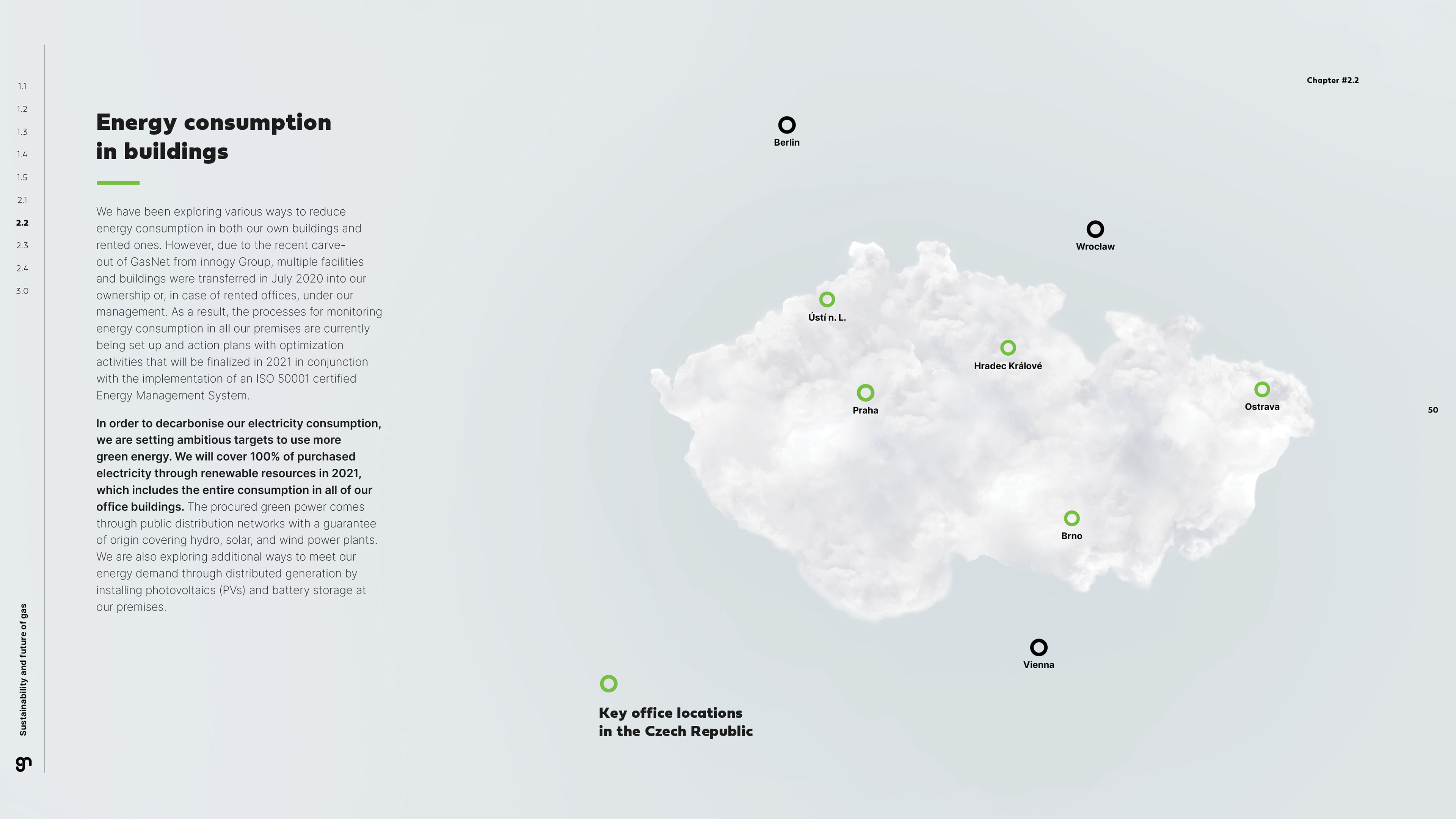
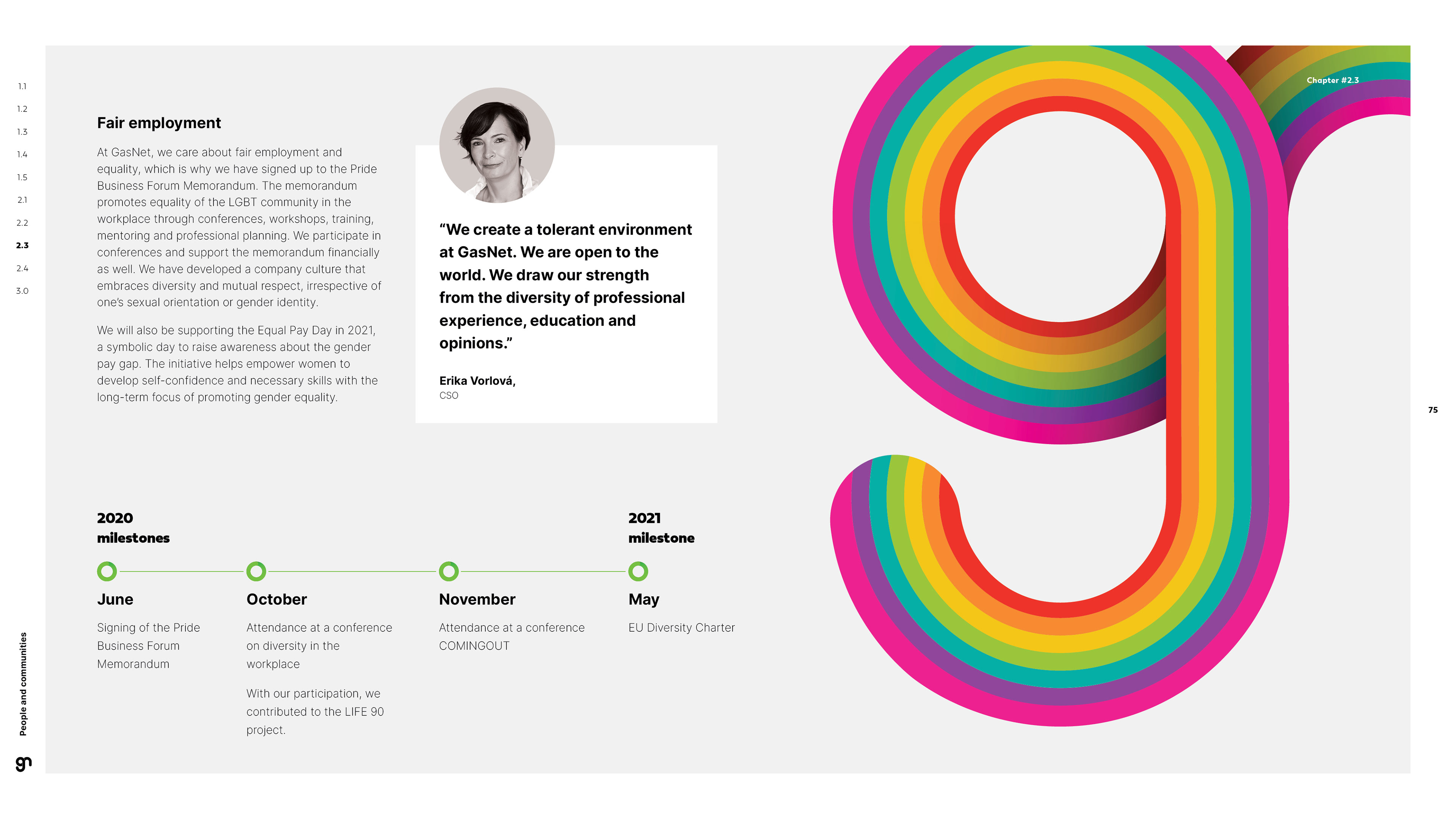
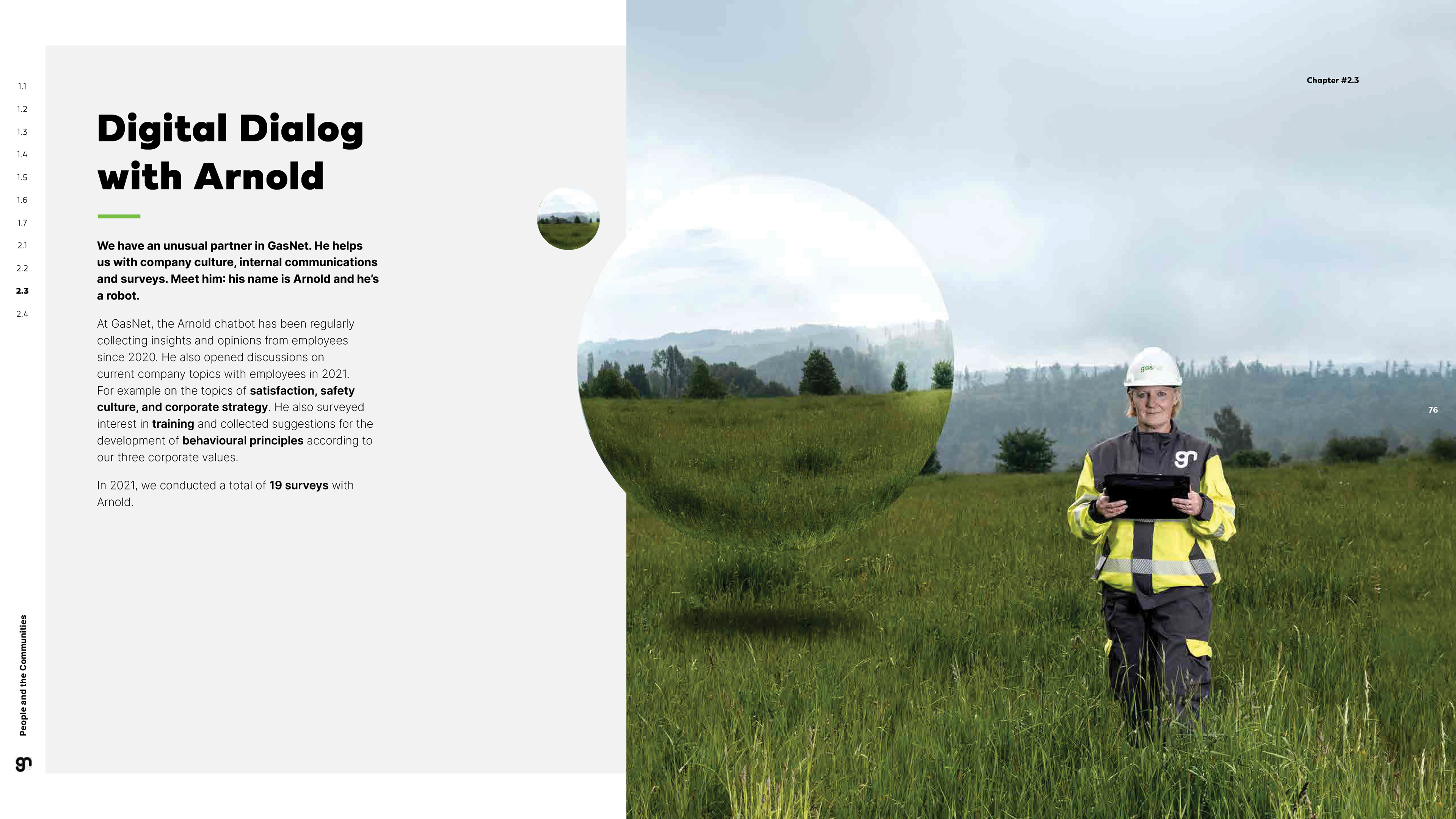
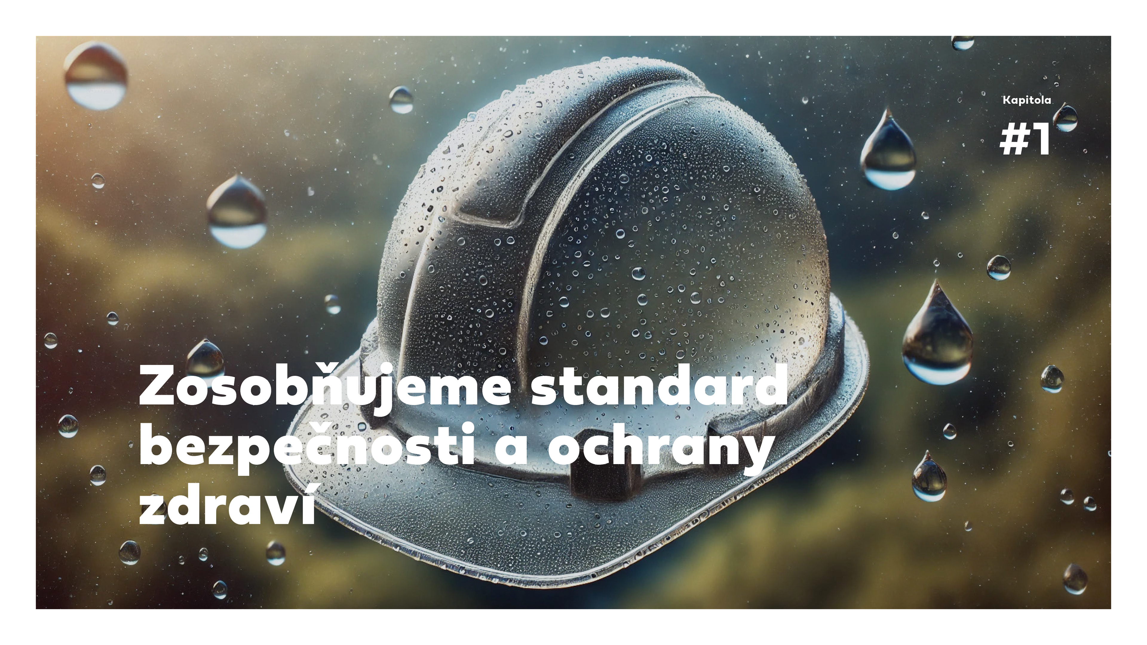
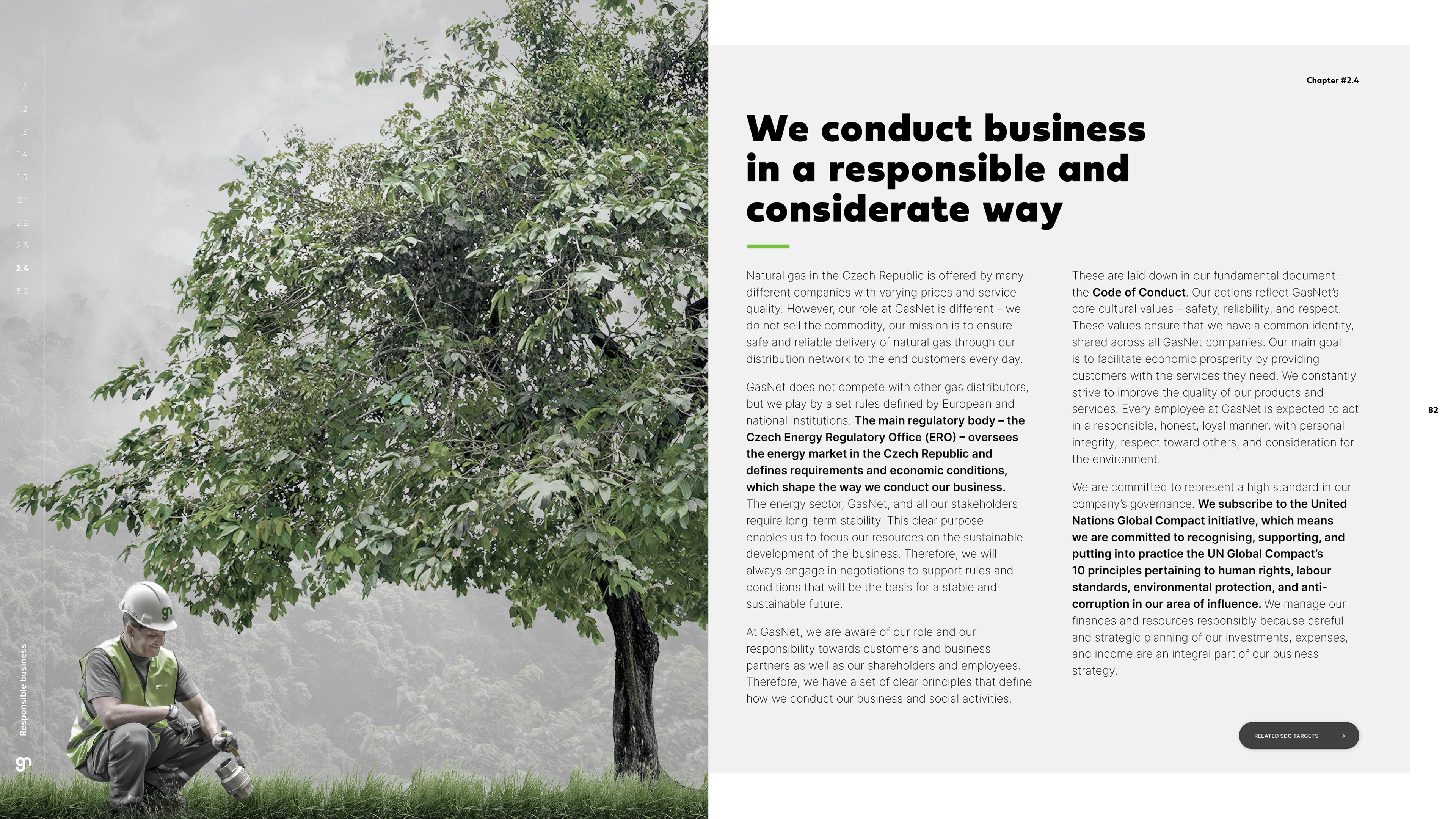
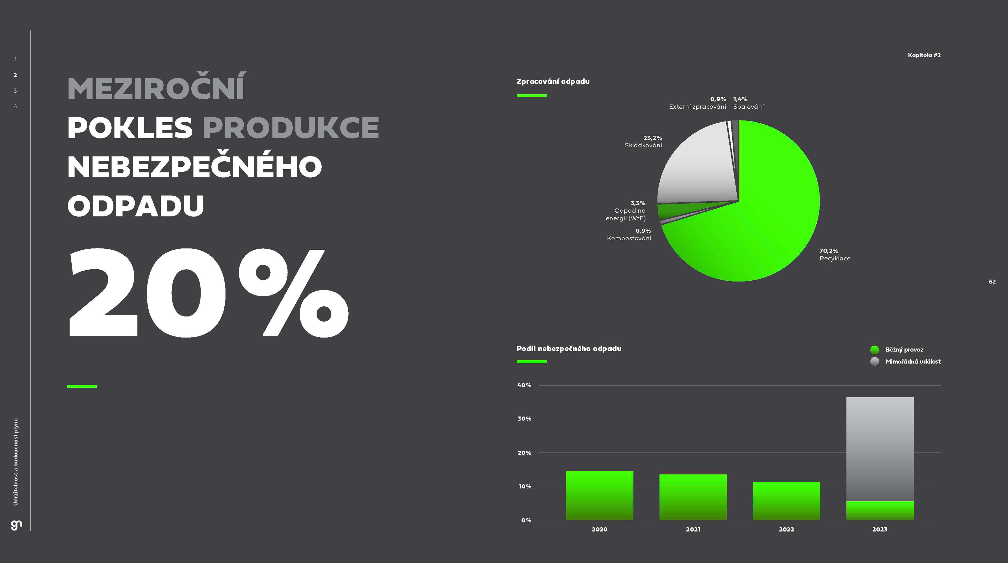
As this company of hundreds got a new face, it meant extraordinary amount of materials we needed to produce, set, template and define. It was fun and long-term process. Once we set the overall brand I could create this complex brandmanual. We then dived into all the office spaces and sprinkled our aesthetic touches all over. Since then, our client is in caring hands of marketing agency for marketing support and social media materials, my only yearly task here is the big and detailed Sustainability report.
For graphite.studio 2020
